---
title: "Chapter 2: Mathematical and Statistical Foundations"
subtitle: "Probability, distributions, and the logic of inference"
---
```{r}
#| label: setup
#| include: false
library(tidyverse)
library(patchwork)
theme_set(theme_minimal(base_size = 13))
options(digits = 4, scipen = 999)
```
::: {.callout-note}
## Learning Objectives
By the end of this chapter you will be able to:
- Describe the key distributions used in regression inference: Normal, $t$, $F$, $\chi^2$
- Apply the logic of hypothesis testing: null hypothesis, test statistic, p-value, and decision rule
- Construct and interpret confidence intervals
- Simulate and visualise statistical distributions in R
:::
---
## Probability and Random Variables
### Discrete Random Variables
A **discrete random variable** $X$ takes a countable set of values $\{x_1, x_2, \ldots\}$. Its **probability mass function (PMF)** assigns probability to each value: $p(x_k) = P(X = x_k) \geq 0$, with $\sum_k p(x_k) = 1$.
**Expected value** is the probability-weighted average:
$$E[X] = \sum_k x_k \cdot P(X = x_k) = \sum_k x_k p(x_k)$$
*Example:* A fair die. $E[X] = 1 \cdot \frac{1}{6} + 2 \cdot \frac{1}{6} + \cdots + 6 \cdot \frac{1}{6} = 21/6 = 3.5$.
**Properties of expectation** (linearity):
$$E[aX + b] = aE[X] + b, \qquad E[X + Y] = E[X] + E[Y]$$
Note: $E[g(X)] \neq g(E[X])$ in general (Jensen's inequality). For example, $E[X^2] \neq (E[X])^2$ unless $X$ is constant.
### Variance: Derivation of the Computing Formula
**Variance** measures the average squared deviation from the mean:
$$\text{Var}(X) = E[(X - \mu)^2] \qquad \text{where } \mu = E[X]$$
**Derivation of the computing formula.** Expand $(X - \mu)^2 = X^2 - 2\mu X + \mu^2$:
$$\text{Var}(X) = E[X^2 - 2\mu X + \mu^2] = E[X^2] - 2\mu E[X] + \mu^2 = E[X^2] - 2\mu^2 + \mu^2$$
$$\boxed{\text{Var}(X) = E[X^2] - \mu^2 = E[X^2] - (E[X])^2}$$
This computing formula is often more convenient than applying the definition directly.
**Properties of variance:**
$$\text{Var}(aX + b) = a^2 \text{Var}(X)$$
$$\text{Var}(X + Y) = \text{Var}(X) + \text{Var}(Y) + 2\text{Cov}(X, Y)$$
### Variance of the Sample Mean
A key result justifying why larger samples give more precise estimates:
$$\text{Var}(\bar{X}) = \text{Var}\!\left(\frac{1}{n}\sum_{i=1}^n X_i\right) = \frac{1}{n^2}\sum_{i=1}^n \text{Var}(X_i) = \frac{n\sigma^2}{n^2} = \frac{\sigma^2}{n}$$
(using independence of $X_1, \ldots, X_n$ and identical variance $\sigma^2$). Therefore $\text{se}(\bar{X}) = \sigma/\sqrt{n}$: the standard error falls at rate $1/\sqrt{n}$. Quadrupling the sample size halves the standard error.
### Covariance and Correlation
**Covariance** measures how two random variables move together:
$$\text{Cov}(X, Y) = E[(X - \mu_X)(Y - \mu_Y)] = E[XY] - E[X]E[Y]$$
**Correlation** is the scale-free version:
$$\text{Corr}(X, Y) = \rho_{XY} = \frac{\text{Cov}(X, Y)}{\sqrt{\text{Var}(X)\text{Var}(Y)}}$$
$\rho_{XY} \in [-1, 1]$. If $X$ and $Y$ are **independent**, $\text{Cov}(X,Y) = 0$ and $\rho_{XY} = 0$. The converse is false: zero correlation does not imply independence (unless both are jointly normal).
### Log Returns in Finance
In finance and time series economics, **log returns** are defined as:
$$r_t = \ln\!\left(\frac{P_t}{P_{t-1}}\right) = \ln(P_t) - \ln(P_{t-1}) = \Delta \ln(P_t)$$
where $P_t$ is an asset price. Log returns are preferred because: (i) they are approximately equal to percentage returns for small changes, (ii) multi-period log returns are additive ($r_{0 \to T} = \sum_{t=1}^T r_t$), and (iii) they are more likely to be approximately normal (by CLT) than raw price changes. We encounter this when taking log differences of non-stationary price series in Chapter 12.
---
## Random Variables and Distributions
A **random variable** $X$ maps outcomes of a random experiment to real numbers. Its behaviour is summarised by a **probability distribution**.
### The Normal Distribution
The **Normal (Gaussian) distribution** $X \sim \mathcal{N}(\mu, \sigma^2)$ has PDF:
$$
f(x) = \frac{1}{\sigma\sqrt{2\pi}} \exp\!\left(-\frac{(x-\mu)^2}{2\sigma^2}\right)
$$
Key properties:
- Symmetric around $\mu$
- Mean $= \mu$, Variance $= \sigma^2$
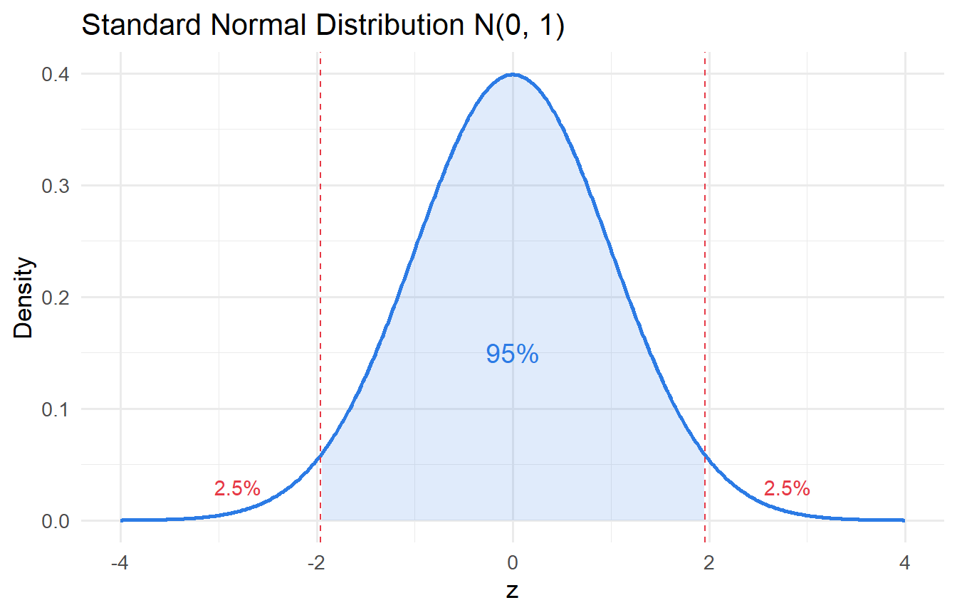
- The **standard normal** $Z \sim \mathcal{N}(0,1)$ arises by standardising: $Z = (X - \mu)/\sigma$
```{r}
#| label: fig-normal
#| fig-cap: "Standard normal distribution with 95% critical region shaded."
tibble(x = seq(-4, 4, length.out = 500)) |>
  mutate(density = dnorm(x)) |>
  ggplot(aes(x, density)) +
  geom_line(linewidth = 1, colour = "#2c7be5") +
  geom_area(data = \(d) filter(d, x >= -1.96 & x <= 1.96),
            fill = "#2c7be5", alpha = 0.15) +
  geom_vline(xintercept = c(-1.96, 1.96), linetype = "dashed", colour = "#e63946") +
  annotate("text", x = 0, y = 0.15, label = "95%", size = 5, colour = "#2c7be5") +
  annotate("text", x = c(-2.8, 2.8), y = 0.03, label = "2.5%", colour = "#e63946") +
  labs(x = "z", y = "Density", title = "Standard Normal Distribution N(0, 1)")
```
### The $t$ Distribution
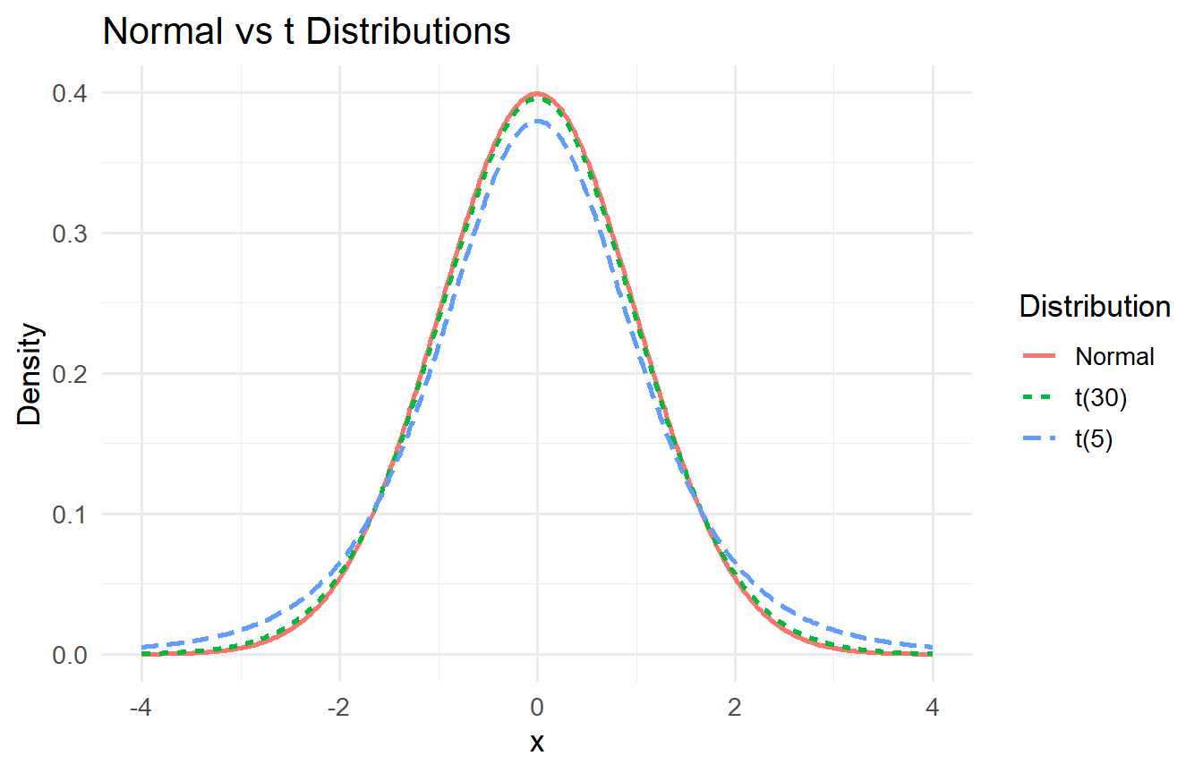
In practice, we rarely know $\sigma^2$ and must estimate it. The **$t$ distribution** with $\nu$ degrees of freedom accounts for this additional uncertainty:
$$
T = \frac{\bar{X} - \mu}{s / \sqrt{n}} \sim t(\nu)
$$
The $t$ distribution has heavier tails than the Normal. As $\nu \to \infty$, $t(\nu) \to \mathcal{N}(0,1)$.
```{r}
#| label: fig-t-dist
#| fig-cap: "Normal vs t distributions. Heavier tails with fewer degrees of freedom."
tibble(x = seq(-4, 4, length.out = 500)) |>
  mutate(
    Normal  = dnorm(x),
    `t(5)`  = dt(x, df = 5),
    `t(30)` = dt(x, df = 30)
  ) |>
  pivot_longer(-x, names_to = "Distribution", values_to = "density") |>
  ggplot(aes(x, density, colour = Distribution, linetype = Distribution)) +
  geom_line(linewidth = 1) +
  labs(x = "x", y = "Density",
       title = "Normal vs t Distributions")
```
### The $F$ Distribution
The **$F$ distribution** arises when comparing variances or testing joint hypotheses in regression:
$$
F = \frac{\chi^2(q)/q}{\chi^2(n-k-1)/(n-k-1)} \sim F(q, n-k-1)
$$
where $q$ is the number of restrictions being tested. We will use the $F$ statistic extensively in Chapter 5.
### The $\chi^2$ Distribution
The **$\chi^2$ distribution** appears in testing variance assumptions and in some specification tests (e.g., the Breusch-Pagan test in Chapter 9):
$$
\chi^2(\nu) = \sum_{i=1}^{\nu} Z_i^2, \quad Z_i \sim \mathcal{N}(0,1) \text{ i.i.d.}
$$
---
## Sampling Distributions and Estimators
A **statistic** computed from a sample (e.g., $\bar{X}$) has its own probability distribution — its **sampling distribution**. This distribution tells us how the statistic would vary across repeated samples.
### Bias and Variance of an Estimator
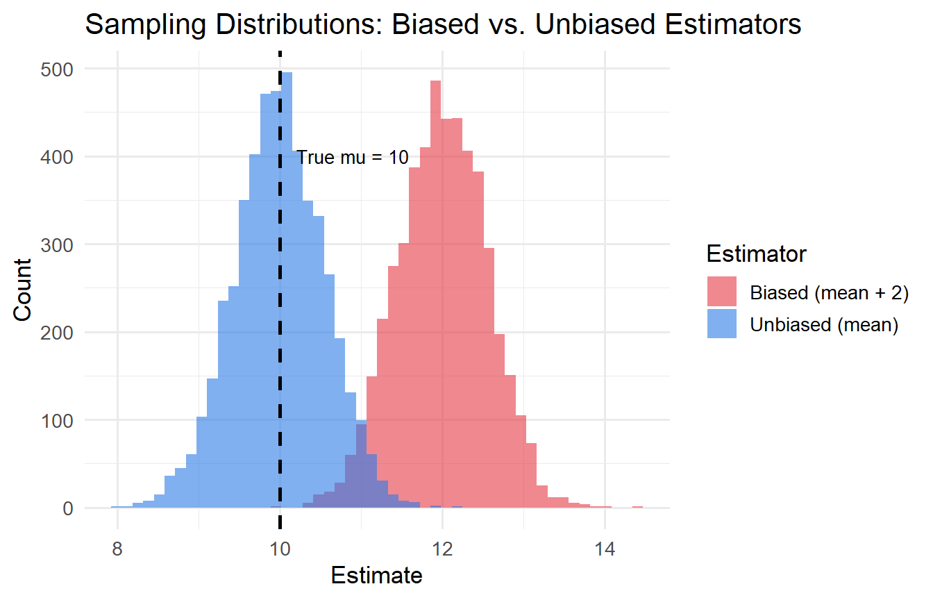
Let $\hat{\theta}$ be an estimator of the population parameter $\theta$.
- **Bias**: $\text{Bias}(\hat{\theta}) = E[\hat{\theta}] - \theta$. An estimator is **unbiased** if $E[\hat{\theta}] = \theta$.
- **Variance**: $\text{Var}(\hat{\theta}) = E[(\hat{\theta} - E[\hat{\theta}])^2]$
- **Mean Squared Error**: $\text{MSE}(\hat{\theta}) = \text{Bias}^2 + \text{Var}(\hat{\theta})$
```{r}
#| label: fig-bias-variance
#| fig-cap: "Illustration of bias and variance in estimators."
set.seed(42)
n_sims <- 5000
true_mu <- 10

# Unbiased: sample mean
# Biased: sample mean + 2 (a deliberately wrong estimator)
sim_results <- tibble(
  unbiased = replicate(n_sims, mean(rnorm(30, mean = true_mu, sd = 3))),
  biased   = replicate(n_sims, mean(rnorm(30, mean = true_mu, sd = 3))) + 2
)

sim_results |>
  pivot_longer(everything(), names_to = "estimator", values_to = "estimate") |>
  ggplot(aes(estimate, fill = estimator)) +
  geom_histogram(alpha = 0.6, bins = 50, position = "identity") +
  geom_vline(xintercept = true_mu, linetype = "dashed", linewidth = 1) +
  scale_fill_manual(values = c("#e63946", "#2c7be5"),
                    labels = c("Biased (mean + 2)", "Unbiased (mean)")) +
  labs(x = "Estimate", y = "Count", fill = "Estimator",
       title = "Sampling Distributions: Biased vs. Unbiased Estimators") +
  annotate("text", x = true_mu + 0.2, y = 400, label = "True mu = 10",
           hjust = 0, size = 3.5)
```
The vertical dashed line is the true value $\mu = 10$. The blue distribution centres on $10$ (unbiased); the red one on $12$ (biased).
---
## Hypothesis Testing
The logic of hypothesis testing:
1. State the **null hypothesis** $H_0$ (the claim we are trying to falsify) and the **alternative** $H_1$
2. Choose a **significance level** $\alpha$ (typically 0.05 or 0.01) — the probability of incorrectly rejecting $H_0$
3. Compute the **test statistic** from the data
4. Find the **p-value** — the probability of observing a test statistic as extreme as ours, if $H_0$ were true
5. **Reject $H_0$** if $p < \alpha$; **fail to reject** otherwise
::: {.callout-important}
## Caution: What a p-value Is and Is Not
A p-value is **not** the probability that $H_0$ is true. It is the probability of the observed data (or more extreme) given that $H_0$ is true. These are very different things.
:::
### Type I and Type II Errors
| Decision | $H_0$ True | $H_0$ False |
|----------|-----------|------------|
| Reject $H_0$ | **Type I error** (false positive), prob. = $\alpha$ | Correct (power = $1-\beta$) |
| Fail to reject $H_0$ | Correct | **Type II error** (false negative), prob. = $\beta$ |
### One-Sample $t$-Test
To test whether the population mean equals a hypothesised value $\mu_0$:
$$
t = \frac{\bar{X} - \mu_0}{s / \sqrt{n}} \sim t(n-1) \text{ under } H_0
$$
```{r}
#| label: one-sample-t
set.seed(123)
wages <- rnorm(n = 50, mean = 26, sd = 8)  # hypothetical hourly wages

# Test H0: mean wage = 25
t.test(wages, mu = 25)
```
We can extract the key components:
```{r}
#| label: t-test-tidy
test_result <- t.test(wages, mu = 25)

tibble(
  statistic  = test_result$statistic,
  df         = test_result$parameter,
  p_value    = test_result$p.value,
  conf_low   = test_result$conf.int[1],
  conf_high  = test_result$conf.int[2],
  estimate   = test_result$estimate
)
```
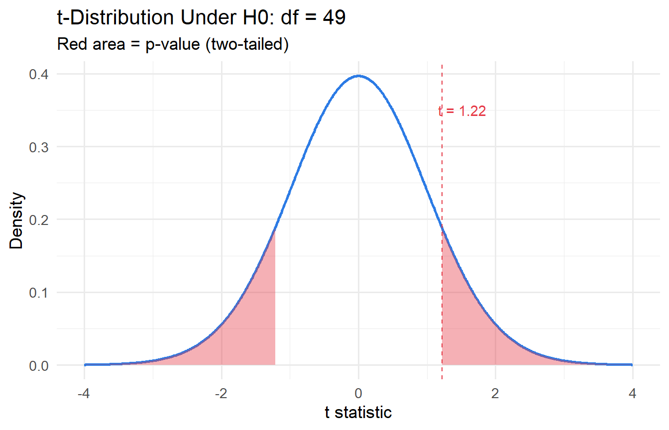
### Visualising the Test
```{r}
#| label: fig-t-test-viz
#| fig-cap: "t-statistic under the null, with observed value marked."
t_stat <- as.numeric(test_result$statistic)
df_val <- test_result$parameter

tibble(x = seq(-4, 4, 0.01)) |>
  mutate(density = dt(x, df = df_val)) |>
  ggplot(aes(x, density)) +
  geom_line(colour = "#2c7be5", linewidth = 1) +
  geom_area(data = \(d) filter(d, x >= abs(t_stat)),
            fill = "#e63946", alpha = 0.4) +
  geom_area(data = \(d) filter(d, x <= -abs(t_stat)),
            fill = "#e63946", alpha = 0.4) +
  geom_vline(xintercept = t_stat, colour = "#e63946", linetype = "dashed") +
  annotate("text", x = t_stat + 0.3, y = 0.35,
           label = paste0("t = ", round(t_stat, 2)), colour = "#e63946") +
  labs(x = "t statistic", y = "Density",
       title = paste0("t-Distribution Under H0: df = ", round(df_val)),
       subtitle = "Red area = p-value (two-tailed)")
```
---
## The Central Limit Theorem
::: {.callout-note}
## Central Limit Theorem
Let $X_1, X_2, \ldots, X_n$ be i.i.d. with mean $\mu$ and finite variance $\sigma^2 > 0$. Then as $n \to \infty$:
$$\frac{\bar{X}_n - \mu}{\sigma/\sqrt{n}} \xrightarrow{d} \mathcal{N}(0, 1)$$
For any $z$: $P\!\left(\frac{\bar{X}_n - \mu}{\sigma/\sqrt{n}} \leq z\right) \to \Phi(z)$ where $\Phi$ is the standard normal CDF.
:::
The CLT is the engine of statistical inference. It tells us that regardless of the shape of the underlying distribution (skewed, bimodal, discrete), the **sample mean** is approximately normally distributed for large $n$. This justifies using $z$-tests and, via the connection to the $t$-distribution, $t$-tests in regression.
**Why "in distribution," not "in probability"?** The CLT standardises by $\sigma/\sqrt{n}$ which shrinks to zero. The sample mean $\bar{X}_n$ does converge in probability to $\mu$ (LLN) — but the CLT describes the *shape* of its fluctuations around $\mu$, not the fluctuations themselves. As $n$ grows, $\bar{X}_n$ gets closer to $\mu$, but the standardised gap $\sqrt{n}(\bar{X}_n - \mu)/\sigma$ maintains a $\mathcal{N}(0,1)$ shape.
---
## Confidence Intervals
A **95% confidence interval** for $\mu$ is:
$$
\bar{X} \pm t_{0.025, n-1} \cdot \frac{s}{\sqrt{n}}
$$
This does **not** mean "there is a 95% probability that $\mu$ lies in this interval." Rather, if we repeated the sampling procedure many times, 95% of the constructed intervals would contain $\mu$.
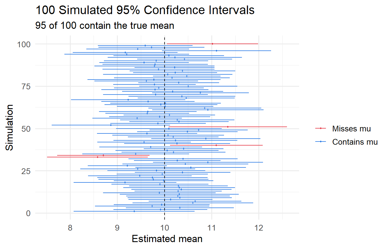
```{r}
#| label: fig-ci-simulation
#| fig-cap: "100 simulated 95% confidence intervals. Red = intervals that miss the true mean."
set.seed(2024)
true_mean <- 10
n <- 30

ci_data <- map_dfr(1:100, function(i) {
  samp <- rnorm(n, mean = true_mean, sd = 3)
  test <- t.test(samp, mu = true_mean)
  tibble(
    sim     = i,
    mean    = mean(samp),
    lo      = test$conf.int[1],
    hi      = test$conf.int[2],
    covers  = test$conf.int[1] <= true_mean & test$conf.int[2] >= true_mean
  )
})

ggplot(ci_data, aes(y = sim, x = mean, xmin = lo, xmax = hi, colour = covers)) +
  geom_errorbarh(height = 0) +
  geom_point(size = 0.8) +
  geom_vline(xintercept = true_mean, linetype = "dashed") +
  scale_colour_manual(values = c("TRUE" = "#2c7be5", "FALSE" = "#e63946"),
                      labels = c("TRUE" = "Contains mu", "FALSE" = "Misses mu"),
                      name = "") +
  labs(x = "Estimated mean", y = "Simulation",
       title = "100 Simulated 95% Confidence Intervals",
       subtitle = paste0(sum(ci_data$covers), " of 100 contain the true mean"))
```
In this simulation, `r sum(ci_data$covers)` out of 100 intervals capture $\mu = 10$, consistent with 95% nominal coverage.
---
## Tutorials
**Tutorial 2.1**
A sample of 40 economics graduates has a mean starting salary of \$72,000 with a standard deviation of \$12,000.
a. Construct a 95% confidence interval for the population mean starting salary.
b. Test $H_0: \mu = 70{,}000$ against $H_1: \mu > 70{,}000$ at the 5% significance level.
c. What does your p-value tell you?
::: {.callout-tip collapse="true"}
## Solution
```{r}
#| label: ex2-1-solution
x_bar <- 72000
s     <- 12000
n     <- 40
mu_0  <- 70000

# t-statistic
t_stat_ex <- (x_bar - mu_0) / (s / sqrt(n))
df_ex     <- n - 1

# p-value (one-tailed, upper)
p_val <- pt(t_stat_ex, df = df_ex, lower.tail = FALSE)

# 95% CI
margin <- qt(0.975, df = df_ex) * (s / sqrt(n))
ci     <- x_bar + c(-margin, margin)

cat("t-statistic:", round(t_stat_ex, 3), "\n")
cat("p-value (one-tailed):", round(p_val, 4), "\n")
cat("95% CI: [", round(ci[1]), ",", round(ci[2]), "]\n")
```
At $\alpha = 0.05$, we **fail to reject** $H_0$ (p = `r round(p_val, 3)` > 0.05). There is insufficient evidence that the mean starting salary exceeds \$70,000. Note: the 95% CI does include \$70,000, consistent with failing to reject.
:::
**Tutorial 2.2**
Explain the difference between a **one-tailed** and a **two-tailed** test. Under what circumstances would you use each?
::: {.callout-tip collapse="true"}
## Solution
A **two-tailed test** (e.g., $H_1: \mu \neq \mu_0$) distributes the rejection region equally across both tails of the distribution. Use this when you have no prior expectation about the direction of the effect.
A **one-tailed test** (e.g., $H_1: \mu > \mu_0$) concentrates the rejection region in one tail. Use this when theory gives you a strong directional prediction before seeing the data. One-tailed tests have more power to detect effects in the predicted direction but cannot detect effects in the other direction.
In practice, two-tailed tests are the default in economics to avoid overstating evidence.
:::
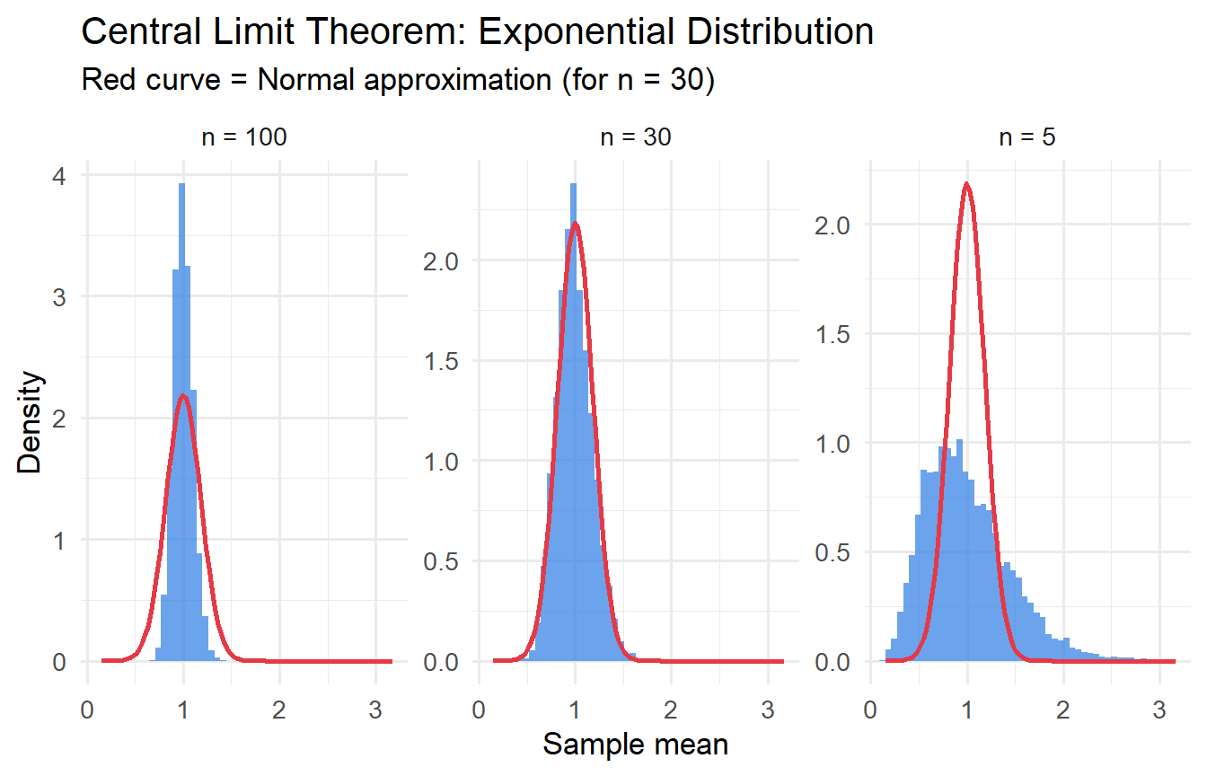
**Tutorial 2.3**
Simulate the Central Limit Theorem: draw 5,000 samples of size $n \in \{5, 30, 100\}$ from an exponential distribution (skewed) and plot the sampling distribution of $\bar{X}$. How does the shape change as $n$ increases?
::: {.callout-tip collapse="true"}
## Solution
```{r}
#| label: ex2-3-clt
#| fig-cap: "CLT in action: sampling distribution of the mean from an Exponential(1) distribution."
set.seed(99)
rate   <- 1     # mean = 1/rate = 1
n_sims <- 5000

map_dfr(c(5, 30, 100), function(n) {
  tibble(
    n      = n,
    x_bar  = replicate(n_sims, mean(rexp(n, rate = rate)))
  )
}) |>
  mutate(n_label = paste("n =", n)) |>
  ggplot(aes(x_bar)) +
  geom_histogram(aes(y = after_stat(density)), bins = 50,
                 fill = "#2c7be5", alpha = 0.7) +
  stat_function(fun = dnorm,
                args = list(mean = 1/rate, sd = (1/rate)/sqrt(30)),
                colour = "#e63946", linewidth = 1) +
  facet_wrap(~n_label, scales = "free_y") +
  labs(x = "Sample mean", y = "Density",
       title = "Central Limit Theorem: Exponential Distribution",
       subtitle = "Red curve = Normal approximation (for n = 30)")
```
As $n$ increases from 5 to 100, the sampling distribution of $\bar{X}$ converges to a Normal shape, even though the underlying exponential distribution is highly right-skewed. This is the **Central Limit Theorem** in action.
:::